UI UX Designer Resume Format, with 3 Full Samples
A UI UX designer is hired on evidence of problems reframed, flows that lifted a real metric, and a portfolio that shows the thinking rather than only the final screens. Most resumes list Figma, wireframes and user research and forget the conversion they moved, the drop-off they fixed and the research that changed the design. Below are three complete resumes, one for a fresher with a bootcamp and two end-to-end case studies, one for a product designer with four years owning features on a live app, and one for a senior designer leading a design system and a small team. After the samples come the format rules, the portfolio link that decides your fate, the terms a parser matches literally, and the mistakes that end a screen before a human opens your work.
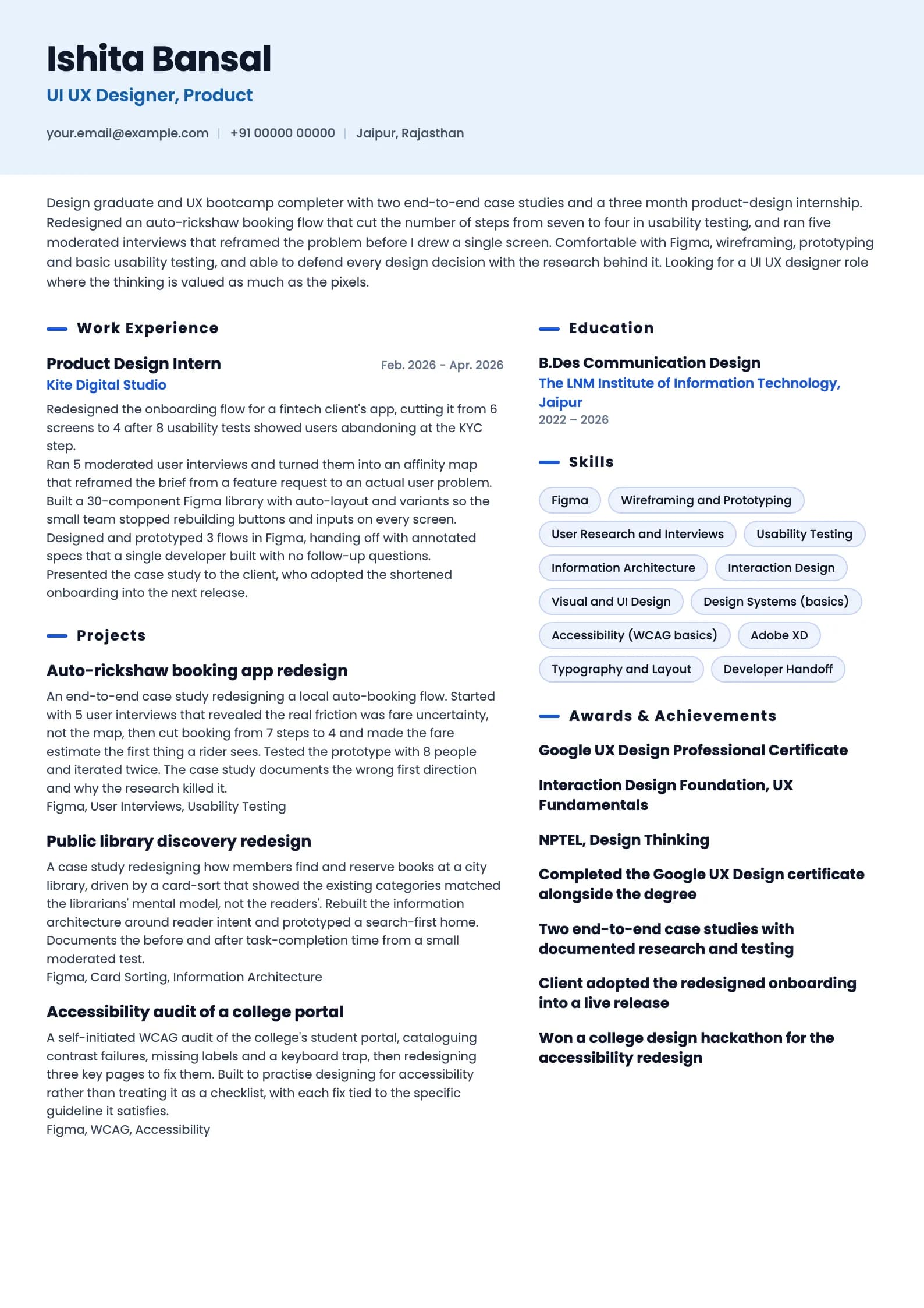
Build my resumeUI UX Designer resume example, Fresher (0 to 1 year)
ai-era templateIs your resume good enough?
Upload the resume you have now and see what an applicant tracking system reads before a ui ux designer recruiter ever does.
Free to run. Sign in with your mobile number to see your score.
UI UX Designer resume example, Mid-level (4 years)
professional template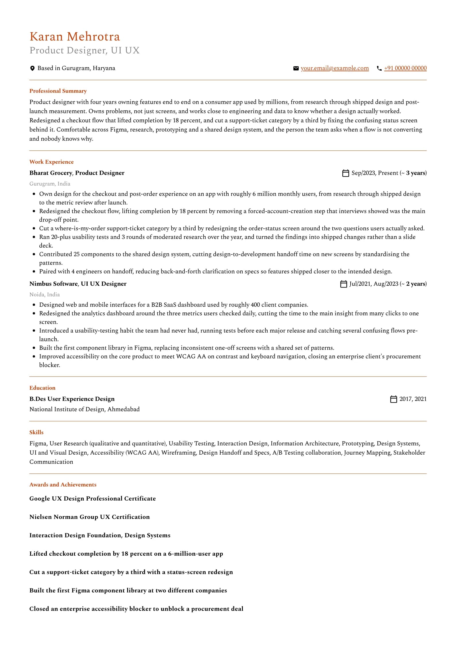
Want this structure with your own details? Build it in the resume builder.
UI UX Designer resume example, Senior (9 years)
header-band template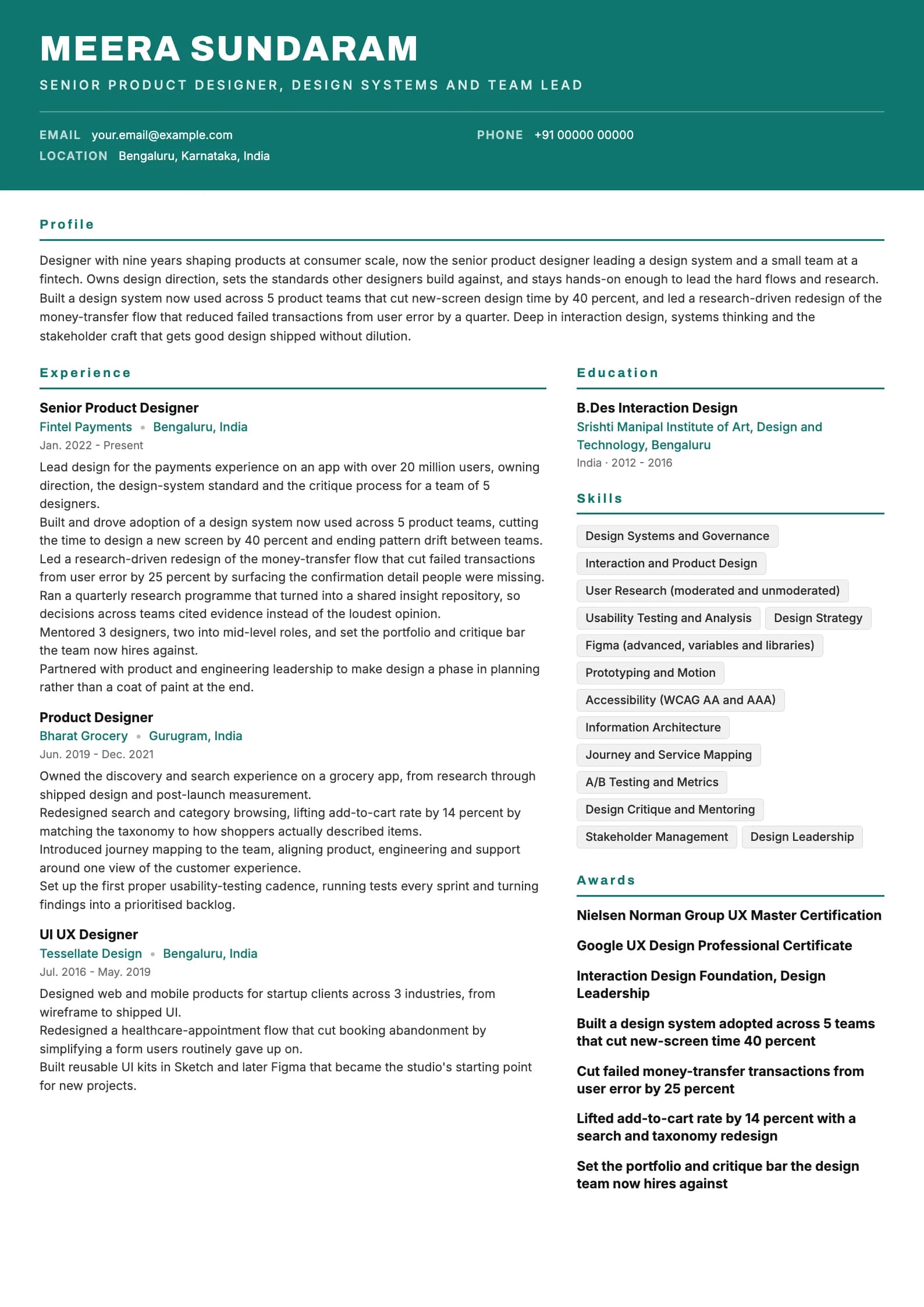
The format that works for UI UX designer resumes in India
Reverse chronological is the only layout worth using. Put the most recent role first, work backwards, and keep the dates in plain view. Functional resumes that group everything under Design Skills and drop the dates read as an attempt to hide a gap, and reviewers treat them that way. A gap is better explained in one honest line than buried under a tool list. A designer's resume has a rule the others do not: the portfolio link is the most important single element on the page, and it belongs in the header where it cannot be missed. Many design hiring managers open the portfolio first and read the resume second, so a resume with no link, or a link to an empty Behance, is close to an automatic pass. Make it a live URL to a portfolio with real case studies, not a folder of dribbble shots. Resist the temptation to make the resume itself a design showcase. A wildly art-directed CV with custom fonts, colour blocks and a two-column collage feels on-brand but parses badly and often reads as compensating for a thin portfolio. Let the resume be clean and legible, and let the portfolio carry the visual craft. Length is one page up to roughly six years, two only if the second page carries real shipped work. Four things belong nowhere on a design resume here either: a photograph, date of birth, marital status and father's name. They survive from an older campus-placement template and add nothing to a design screen. The table below sets out the section order.
| Section | Where it goes | Why |
|---|---|---|
| Name, headline and portfolio link | Top, above everything | The portfolio link is the single most important element. Put the live URL in the header. |
| Professional summary | Directly under the header | Three lines. Focus area, years, and the strongest design outcome with a metric. |
| Work experience | Next, for anyone with a job | Most recent first. Frame bullets as problem, action, outcome. |
| Case studies or projects | Above experience for freshers | For a fresher these are the evidence. Two deep ones beat five shallow. |
| Skills and tools | Below experience | Grouped: design, research, systems, tools. Not a 30-item tool wall. |
| Education | Bottom, unless you are a fresher | Degree, institution, years. A design degree helps but the portfolio decides. |
| Certifications | After education, or beside skills | Google UX and NN/g carry weight, especially for switchers and freshers. |
The portfolio link decides your fate, so treat it that way
For a UI UX designer, the portfolio is the interview before the interview. A hiring manager who cannot find a live link, or clicks one that leads to a login wall or an empty page, usually stops there. Put the URL in the header of the resume as plain, clickable text, and make sure it works from a phone, because that is often where it gets opened first. A portfolio of pretty final screens is not enough. What separates a shortlist from a rejection is the thinking: the problem you were given, the research that reframed it, the directions you tried and killed, and the outcome after launch. Two case studies that walk through that arc beat ten galleries of polished mockups, because the mockups show taste and the case studies show judgement, and judgement is what gets hired. Be honest about your role. On a team project, say what you personally did rather than implying you designed the whole app. Reviewers ask exactly this in the interview, and a case study that claims sole credit for team work collapses under one follow-up question. "I owned the checkout flow; a colleague owned onboarding" is stronger than a vague "designed the app", because it is specific and it is defensible. Include at least one case study with a measured outcome, even a small one from a usability test. Designers often resist numbers as reductive, but a flow that cut task time or lifted completion is exactly the evidence a product-minded hiring manager is looking for, and its absence is why many beautiful portfolios do not convert.
Before you send the resume, open your portfolio link in an incognito window on your phone. If it needs a password, loads slowly, or shows shots with no story, fix that first, because it is the thing most likely to decide the outcome.
Writing a summary a hiring manager actually reads
The block under your name is the part you can be reasonably sure gets read, so it should carry three facts: what you design, how long you have designed it, and the strongest thing that happened because of your work, ideally a metric a product team cares about. Three or four lines, no adjectives that cannot be checked. The old objective line, seeking a creative role in a reputed organisation to utilise your design skills, tells the reader nothing they did not assume from the application. Replace it with a summary. An objective describes what you want, a summary describes what you have already shipped and moved, and only one is evidence. Freshers often believe they have nothing to summarise. Look at the fresher sample: it names the tools, states the bootcamp and internship, and points at a case study with real user research and a measured reduction in steps. That is a genuine summary built from a degree, a certificate and two case studies. What it avoids is "passionate about creating delightful user experiences", a phrase so common on graduate design resumes it now carries no information at all. A practical test: read your summary and ask whether a classmate with the same Google UX certificate could paste it onto their resume unchanged. If they could, it describes the course, not you. Add the specific product, the specific metric and the specific ownership until it stops being transferable.
Professional summary, mid-level designer
Weak
Creative and passionate UI UX designer with 4+ years of experience in creating beautiful and user-friendly designs using Figma, seeking a challenging role in a reputed organisation.
Strong
Product designer with four years owning features end to end on a consumer app used by millions, from research to post-launch measurement. Lifted checkout completion by 18 percent and cut a support-ticket category by a third.
The rewrite trades a keyword list and self-praise for the scope of ownership and two verifiable, product-relevant results.
Experience bullets: problem, action, outcome
Every strong bullet in the samples follows the same shape. It names the problem or the design decision, states what you did, and closes with what measurably moved. Design work is especially prone to bullets that describe activity, so this discipline matters more here than almost anywhere: "designed screens" and "created wireframes" describe motion, not results. Start with the outcome and work backwards. Designers usually write the artefact first, then struggle to attach an outcome, which produces bullets like "designed the checkout screens in Figma". Instead ask what changed for the user or the business after the design shipped: completion rose, task time fell, a support category shrank, a drop-off point closed, an accessibility blocker cleared. Then write the sentence that ends in that fact. Ground the outcome in research where you can. "Removing a forced-account-creation step that interviews showed was the main drop-off point" is far stronger than "improved the checkout", because it shows the change came from evidence rather than taste, and taste is the thing every designer claims. The research is what makes the outcome believable. Where you lack a hard business metric, use a testing or scope number: usability tests run, task-completion time from a moderated test, components contributed to a system, flows owned. Not every design outcome is a percentage, and a task-time reduction from a small test is honest and persuasive. Allocate bullets by recency. Current role gets five or six, the previous role four or five, anything older two or three.
| Level | What bullets must prove | Typical outcome |
|---|---|---|
| Fresher | You can run a full design process, not just draw screens | Steps reduced, tests run, task-time cut, research interviews |
| 1 to 3 years | You own a feature and ground it in research | Completion or conversion, usability tests, components shipped |
| 4 to 6 years | You own problems end to end and measure the result | Metric lifted, support tickets cut, system contribution, research rounds |
| 7 years and up | You set direction and systems across teams | System adoption, business metrics, research programme, team grown |
Experience bullet, product design role
Weak
Designed the checkout screens and other UI elements for the mobile app using Figma.
Strong
Redesigned the checkout flow, lifting completion by 18 percent by removing a forced-account-creation step that interviews showed was the main drop-off point.
Swaps an artefact description for the problem, the specific change and the completion metric it moved, with the research that justified it.
Experience bullet, research work
Weak
Conducted user research and usability testing to understand user needs and improve the product.
Strong
Ran 20-plus usability tests and 3 rounds of moderated research over the year, and turned the findings into shipped changes rather than a slide deck.
Names the volume of research and, crucially, that it led to shipped changes, which is the difference between research that mattered and research that sat in a folder.
If a bullet describes an artefact you made rather than a change it caused, it is describing activity, not impact. Rewrite it until it ends in what moved for the user or the business.
The skills section: grouped, honest, and short enough to defend
A design resume's skills section has two audiences with opposite preferences. The parser wants literal terms it can match, Figma and user research and prototyping. A human wants a short, organised list that signals what kind of designer you are, and specifically whether you are a UI-leaning visual designer, a UX-leaning research and interaction designer, or a genuine end-to-end product designer. Grouping and honest labelling satisfy both. Group by function rather than one long line. Design and interaction, research and testing, systems and accessibility, and tools is a grouping that works for almost every designer. The exact headings matter less than the fact that structure exists. Write names the way the industry writes them: Figma not FIGMA, Adobe XD not AdobeXd. A parser matches on strings. Twelve to sixteen skills is the working range. Below eight the section looks thin. Above twenty it stops being a signal, and a design resume is especially prone to tool padding: listing Figma, Sketch, Adobe XD, Photoshop, Illustrator, InVision, Zeplin, Framer, Principle and Marvel as ten items when your daily tool is Figma and the rest are a login you made once. The list is a contract: every item is a question you have agreed to answer. Be careful not to overstate UX depth if your work is really UI. A visual designer who lists user research, information architecture and journey mapping, but whose portfolio shows only high-fidelity screens, invites a research question they cannot answer. Claim the half of the discipline you actually practise, and be honest about the other.
| Group | What goes in it | How many |
|---|---|---|
| Design and interaction | UI design, interaction design, wireframing, prototyping | 3 to 5 |
| Research and testing | User research, interviews, usability testing, journey mapping | 2 to 4 |
| Systems and quality | Design systems, accessibility (WCAG), information architecture | 2 to 4 |
| Tools | Figma, Adobe XD, and any genuinely used design tools | 2 to 4 |
| Collaboration | Developer handoff, stakeholder communication, critique | 1 to 3 |
Skills section
Weak
Skills: Figma, Sketch, Adobe XD, Photoshop, Illustrator, InVision, Zeplin, Framer, Principle, Marvel, After Effects, Balsamiq, Miro, UX, UI, Wireframing, Prototyping, HTML, CSS, MS Office
Strong
Design: UI design, interaction design, prototyping. Research: user interviews, usability testing, journey mapping. Systems: design systems, WCAG accessibility. Tools: Figma, Adobe XD, Miro.
Cuts the login-once tools and the bare UX and UI keywords, keeps what you can defend, and groups the rest so a human reads it in one pass.
Case studies: what to include and how to describe them
For a fresher, case studies are the resume. They sit above experience, they carry the most weight, and they are where a reviewer decides whether you can run a design process or only produce screens. For an experienced designer they move below experience and shrink, kept only where they show a problem or a domain the day job does not. The common failure is presenting a gallery instead of a story. A row of polished mockups with a one-line caption tells a reviewer you can use Figma, which every applicant can, but not whether you can think. A case study should walk through the problem you were handed, the research that reframed it, at least one direction you tried and abandoned, the final design, and what happened after. The abandoned direction matters more than designers expect: it shows you make decisions against evidence rather than falling in love with the first idea. Pick case studies that show range. One end-to-end product flow with research and a measured outcome, one that demonstrates systems thinking such as a component library or an information-architecture rework, and one that shows a specialism like accessibility is a stronger set than three variations of the same app redesign. Two deep case studies beat five shallow ones. Describe the outcome even when it is modest. A task-completion-time improvement from a small moderated test, a drop in steps, a support-ticket reduction: any of these turns a portfolio piece from a visual exercise into evidence the design worked. If the project never shipped, say so honestly and describe the testing you did instead of implying a launch that never happened.
Case study description, fresher resume
Weak
Food Delivery App: designed a modern and clean UI for a food delivery application with a great user experience using Figma.
Strong
Auto-rickshaw booking redesign: cut booking from 7 steps to 4 after 5 interviews revealed fare uncertainty, not the map, was the real friction, and validated the shorter flow with 8 usability tests.
Swaps self-praise about a clean UI for the research that reframed the problem, the specific change and the testing that validated it.
Where education and certifications belong
Education goes at the bottom for anyone with a full-time job, and near the top for a fresher, who has nothing stronger to lead with, though even for a fresher the portfolio outranks it. A design degree from a strong school helps, but it is the portfolio that decides, and many hired designers come through bootcamps and self-teaching rather than a B.Des. CGPA or percentage is worth keeping while you are a fresher and it is good, but it matters less in design than in engineering, because a hiring manager weighs the case studies far above a grade. Once you have your first full-time role, drop it. Portfolio work from your job is far more predictive than a number from college. Certifications matter most for career switchers and freshers who lack a design degree, where they signal you have learned the discipline formally rather than picked up a tool. The Google UX Design certificate is a recognised entry credential, and the Nielsen Norman Group certifications carry weight for research-heavy roles and at the mid-to-senior level. Write the full name, the issuing body and the year, and let them fade behind shipped work as your experience grows. Do not pad this section with a dozen short online courses. One respected certificate says more than ten one-hour completion badges, and a wall of them reads as course-collecting rather than practice.
Getting through the applicant tracking system
An applicant tracking system is a parser and a search index, not a judge. It reads your file, tries to break it into name, dates, employers, titles and skills, and stores the result so a recruiter can search across candidates. Designers hit ATS problems more than most, because the instinct to make the resume itself a design piece produces exactly the layouts parsers choke on. The layout rules are short, and they matter especially here. One column, because that decorative two-column collage interleaves badly. Standard section headings, so use Work Experience rather than My Journey, and Skills rather than My Superpowers. No text baked into images, because a beautifully typeset name inside a graphic reads as empty space to a parser. Keep the portfolio link as real, selectable text, not a button image, or it may not survive the parse. On wording, mirror the language of the job description where it is honest. If the posting says product designer, and that fits your work, use it alongside UI UX designer. If it says user research, and you do it, write user research. Include both UI and UX explicitly if you practise both, since a search for one should not miss you. Keyword stuffing does not work, and a hidden block of every design tool in white text is found quickly. Write real bullets that naturally contain the right terms, because a bullet describing the usability testing you ran contains the words usability testing in a context that survives human review too. Save as PDF from a design or document tool that embeds real text, then open the file and confirm you can select and copy a sentence. If you exported the resume as a flat image from a design tool, the parser sees nothing at all.
Resume export
Weak
Resume exported as a flat PNG or a single image from a design tool.
Strong
Resume exported as a PDF with real, selectable text.
An image resume is invisible to the parser, which reads no text from it at all; the searchable PDF is the difference between appearing in a recruiter search and never existing to it.
Test your own file before you send it. Copy the text out of the PDF into a plain text editor. If you can read your name, your roles and your portfolio link there, the parser can too; if it comes out blank, you exported an image.
What gets UI UX designer resumes rejected
Most rejections at the resume stage are not close calls. They come from a small set of recurring problems, and all of them are fixable in an afternoon. The list below covers what reviewers of Indian UI UX designer resumes see most often, in rough order of how much damage each one does.
- No portfolio link, a broken one, or a link to an empty gallery. For a designer this is close to an automatic pass, whatever the resume says.
- A portfolio of final screens with no thinking. Mockups show taste; case studies show judgement, and judgement is what gets hired.
- Bullets that describe artefacts, not outcomes. "Designed screens" and "created wireframes" are activity, not impact.
- Over-designing the resume itself into an unparseable two-column collage that reads as compensating for a thin portfolio.
- Exporting the resume as a flat image, so the ATS reads no text and the portfolio link is not clickable.
- Claiming end-to-end UX when the work is really UI, then being unable to answer a single research question in the interview.
- Taking sole credit for team projects, which collapses under one follow-up about who did what.
- A generic objective line and "passionate about delightful experiences", a phrase that now carries no information.
- A photo, date of birth, marital status or father's name, none of which belongs on a design resume and all of which take a case study's space.
- A wall of a dozen tools you logged into once. Claim Figma and what you actually use, not the whole app store.
Read your resume aloud once, then open your portfolio, before sending either. Anything you would be embarrassed to defend in an interview is a line, or a case study, to cut or rewrite.
Skills to put on a ui ux designer resume
Technical
- UI Design
- Interaction Design
- User Research
- Usability Testing
- Wireframing and Prototyping
- Information Architecture
- Design Systems
- Accessibility (WCAG)
- Journey and Service Mapping
- Visual and Typographic Design
- Design Strategy
- A/B Testing collaboration
- Responsive and Mobile Design
- Developer Handoff
Tools and platforms
- Figma
- Adobe XD
- Sketch
- Miro
- FigJam
- Maze
- Photoshop
- Illustrator
- After Effects
- Zeplin
- Notion
- Framer
Working skills
- Stakeholder communication
- Design critique
- Cross-functional collaboration
- Mentoring
- Storytelling and presentation
- Facilitating workshops
- Empathy for users
- Handling feedback
- Prioritisation
Certifications worth listing as a ui ux designer
| Certification | Full name | Worth it for |
|---|---|---|
| Google UX Certificate | Google UX Design Professional Certificate | The most recognised entry credential for UX in India, worth it for a fresher or a career switcher who lacks a design degree and needs to prove they have learned the discipline formally. It teaches the end-to-end process employers expect. Its value fades once you have shipped product work in a portfolio to point at. |
| NN/g UX | Nielsen Norman Group UX Certification | A respected, research-heavy credential that carries weight for UX-leaning and research roles, and at the mid-to-senior level where depth is expected. Worth it for designers who want to signal rigour in research and usability rather than only visual craft. The master certification suits senior candidates building a research reputation. |
| IDF Membership | Interaction Design Foundation Course Certificates | A cost-effective way to build formal UX knowledge across topics like design systems, IA and research, useful for freshers and switchers filling gaps. Individual course certificates are modest signals on their own, so cite the one or two most relevant to the target role rather than listing a dozen. |
| HFI CUA | Human Factors International Certified Usability Analyst | A structured usability and human-factors credential valued in enterprise and research-focused UX roles, particularly where formal process matters. Worth it for designers targeting large organisations or usability-specialist positions. Less relevant for fast-moving startup product-design roles where the portfolio dominates. |
| DesignLab UX | DesignLab UX Academy Certificate | A mentor-led bootcamp credential that, more than the certificate itself, produces the case studies a fresher needs. Worth it for switchers who want structured portfolio guidance. On the resume the portfolio it produced matters far more than the certificate line, so lead with the work. |
Keywords an ATS scans for in a ui ux designer resume
These are the literal terms a parser matches against the job description. Use the ones that are true of you, in the sentences where you did the work, not as a list at the bottom.
- ui ux designer
- product designer
- ux designer
- user research
- usability testing
- figma
- wireframing
- prototyping
- interaction design
- design systems
- information architecture
- accessibility
- WCAG
- user experience
- user interface
- journey mapping
- adobe xd
- portfolio
- design thinking
- developer handoff
UI UX Designer resume FAQ
What salary can a UI UX designer expect in India?
A fresher typically starts around 3.5 to 7 LPA, higher in product companies and strong startups with a good portfolio. A product designer with four to six years owning features usually sits in the 12 to 25 LPA band. Senior designers and design leads with nine years and above commonly earn 28 to 50 LPA and more at strong product companies. A portfolio with measured outcomes, systems experience and a research-led process pushes the top of every band upward, more than any tool or certificate does.
How important is the portfolio versus the resume?
For a UI UX designer the portfolio is more important than the resume, and often decides the outcome before the resume is read closely. Many hiring managers open the portfolio first, and a missing or broken link, or a gallery with no thinking, ends the application regardless of how strong the resume looks. Put a live, working portfolio URL in the resume header, and make sure it shows case studies with process and outcomes, not just final screens.
How long should a UI UX designer resume be?
One page up to about six years of experience, two pages after that only if the second page carries real shipped work rather than a longer tool list. The resume is a summary that points at the portfolio, so it does not need to be exhaustive. If you are struggling to fit one page, cut the oldest role to a line, remove tools you rarely use, and trust the portfolio to carry the depth.
Should the resume itself be heavily designed?
No, keep it clean and legible. It is tempting to treat the resume as a design showcase, but a heavily art-directed CV parses badly in an ATS and often reads as compensating for a thin portfolio. Let the resume be a clear, single-column document that a parser and a busy manager can both read fast, and let the portfolio carry the visual craft. A tasteful, restrained resume signals confidence in the work.
How do I write a UX resume as a fresher or career switcher?
Lead with two or three end-to-end case studies above your experience, and treat each as evidence you can run a design process, not just use Figma. Walk through the problem, the research that reframed it, a direction you abandoned, the final design and any measured outcome from testing. A recognised certificate like the Google UX one helps a switcher, but the case studies decide it. A live portfolio link in the header is non-negotiable.
Should I put UI and UX or product designer as my title?
Use the title that matches the roles you are targeting and be honest about which half of the discipline you practise. UI UX designer is the common Indian job-title search term, so it belongs on the resume for ATS reasons. If your work is genuinely end-to-end, product designer often signals more seniority and product involvement. Do not claim deep UX and research if your portfolio is only high-fidelity screens, because the interview will find the gap.
Does an ATS reject resumes with two columns?
It does not reject them outright, but some parsers read multi-column layouts out of order, which interleaves your sidebar with your experience and produces nonsense in the recruiter's view. Designers are especially prone to this because of the instinct to art-direct the CV. A single-column layout removes the risk, which is why all three samples above use one. Test your file by copying the text out of the PDF into a plain text editor.
What metrics can a designer honestly put on a resume?
More than designers expect. Conversion or completion rate lifted, task-completion time reduced in usability testing, drop-off at a specific step closed, support-ticket categories cut, and components contributed to a design system are all honest and persuasive. Even a small result from a moderated test with eight users is worth stating. If you truly have no numbers, use scope: flows owned, research rounds run, teams a system serves. The absence of any outcome is why many beautiful portfolios do not convert.
Related resume examples and guides
Build your own in any of these formats
Start from a blank resume or upload the one you have. Goodspace renders it in 24 templates, keeps your portfolio link as clean selectable text, and flags the research, systems and Figma keywords an applicant tracking system will look for, and the tool padding it will not credit.
Build my resume